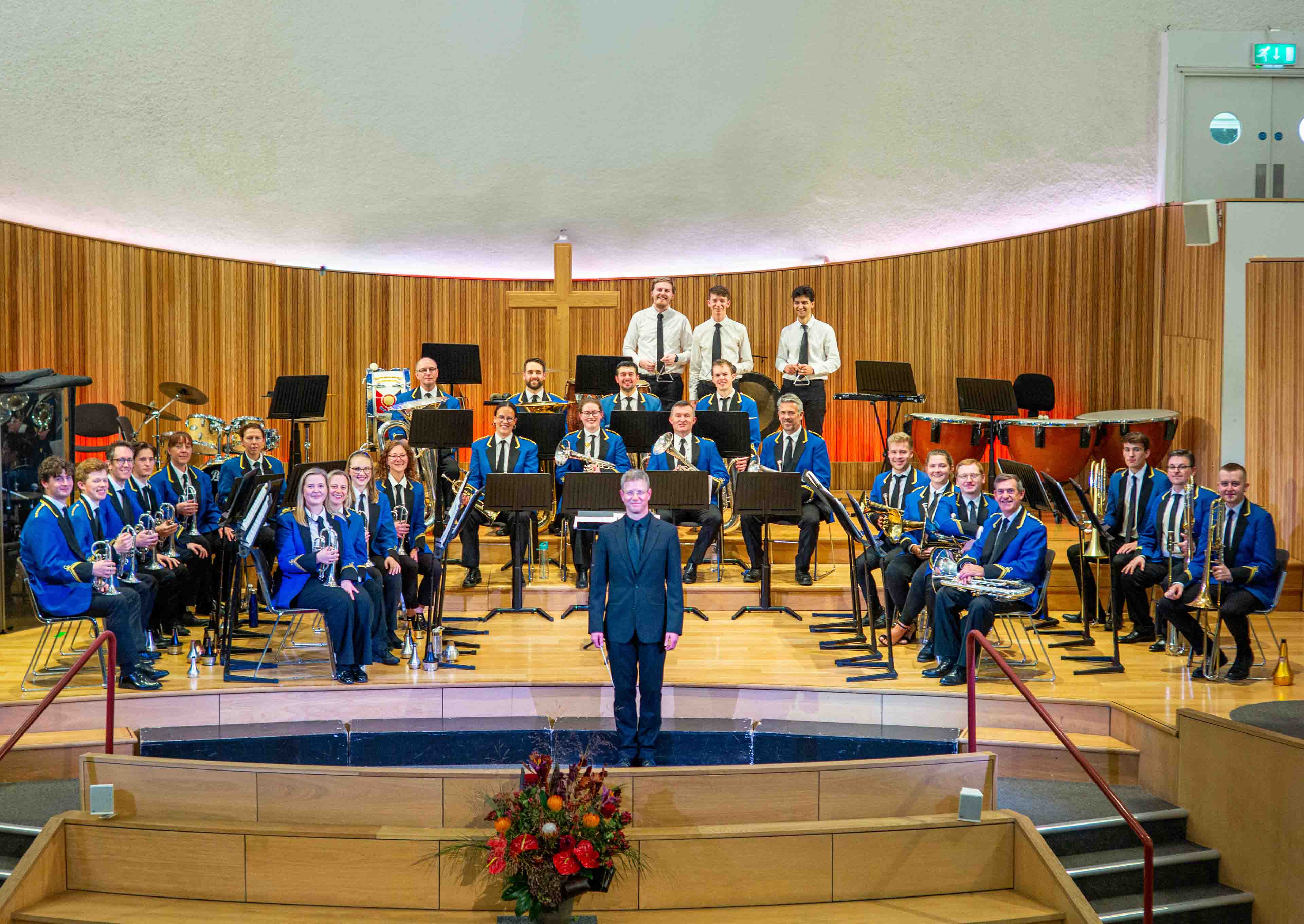
Fulham Brass Band are sad to announce the departure of their Musical Director, Sam Hairsine.
Having joined the band in Summer 2023, Sam has led the band with aplomb, including two appearances at each of the L&SC Regional Championships, Wychavon entertainment contest, and the Whit Friday celebrations in Saddleworth, as well as numerous concerts and community engagements.
Commenting on his time with the band, Sam said “Fulham Brass Band are a fantastic bunch of people. It’s a brilliantly run band that still has massive potential and I’ve loved my time as their MD. It’s really unfortunate that our Area contest next year falls on the same day as two of the Mountbatten Festival of Music performances that I’m conducting with the Royal Marines, but it gives an opportunity for someone else to take the reins and take the band onwards and upwards. I’m very grateful to Fulham for our time together and wish them all the very best for the future.”
Everyone at Fulham Brass Band would like to place on record our immense thanks to Sam. He is both an excellent musician and a consummate professional, and under his enjoyable direction the band has thrived musically and organisationally. Whilst we are sad to lose Sam, we prefer to focus on how fortunate we’ve been in making music with him for the past two and a half years, and we wish him well in all his future endeavours.
The process of appointing a successor to Sam is underway, and a job description and information on how to apply can be found here.
Sam’s final concert with the band will be our Christmas concert at St. Cuthbert’s Church in Earl’s Court on Saturday 6th December at 14:30. For more details and to buy tickets, follow this link.
